Fibre Architecture is a Montreal studio that designs durable, comfortable spaces. On the About page, Kim Cloutier and Laurianne Deslauriers introduce their practice through three ideas: human-centred architecture, Passive House principles and sustainable design.
Moving from Wix to WordPress gave the studio an opportunity to rethink what its website could offer someone planning a project. I designed the Fibre Architecture website so visitors could get to know the team’s work, learn about project stages and fees, and request a first meeting.
ClientFibre Architecture
LocationMontreal, Quebec
ProjectWeb design · WordPress · English and French
A portfolio that invites a closer look
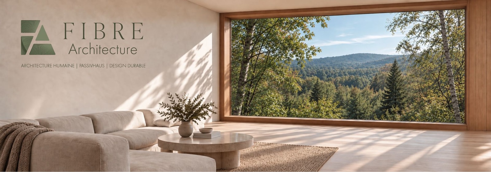
The homepage opens on a sunlit interior. The wide window, natural tones and studio logo set the tone. I carried those elements into the navigation and service pages, using restrained typography and giving the photography room to breathe.
The portfolio gives residential projects and professional collaborations their own space. Each project page brings together key details, a story and a gallery. The La Flèche page, for example, places a photograph of the house next to its construction details.
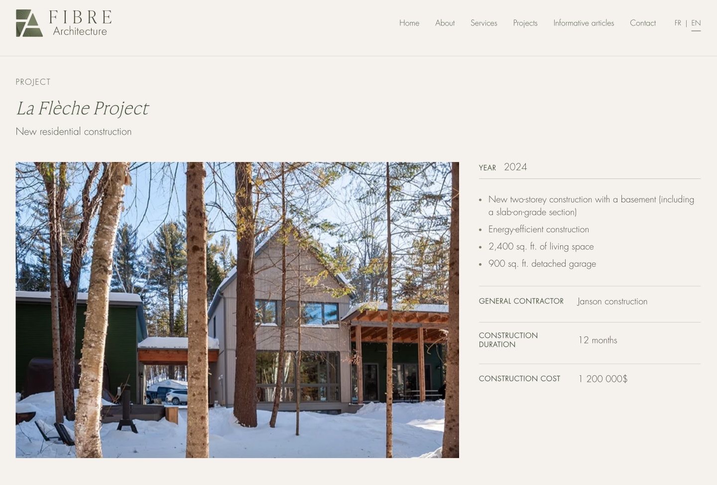
The La Flèche project page pairs a photograph of the house with key project details.

Kim Cloutier, OAQ architect and Passive House designer at Fibre Architecture.
Shaped by reviews with Kim and Laurianne
Kim and Laurianne reviewed the pages at several points in the project. Their feedback on photography, spacing and readability guided specific adjustments for desktop, tablet and phone.
For the About page, I used their portraits and biographies to introduce each architect. Kim describes how her work led her to explore building performance and the comfort of the people who live in those spaces. The layout gives each architect her own space while showing where their approaches meet.
From reading to a first consultation
I moved the informational articles from Wix to WordPress in English and French. Visitors can browse the resources by category. Longer pieces have a table of contents that takes readers directly to sections and subsections.
The fee estimator gives visitors an initial idea of professional fees. For those ready to discuss a project, I added a calendar to the Contact page. It shows the time slots set by the studio while checking its availability in Microsoft 365. Once the team accepts a request, the meeting is added to the selected Outlook calendar.
I brought the booking settings and email templates for the calendar and contact form together in WordPress. The team can update available times and messages in one place.
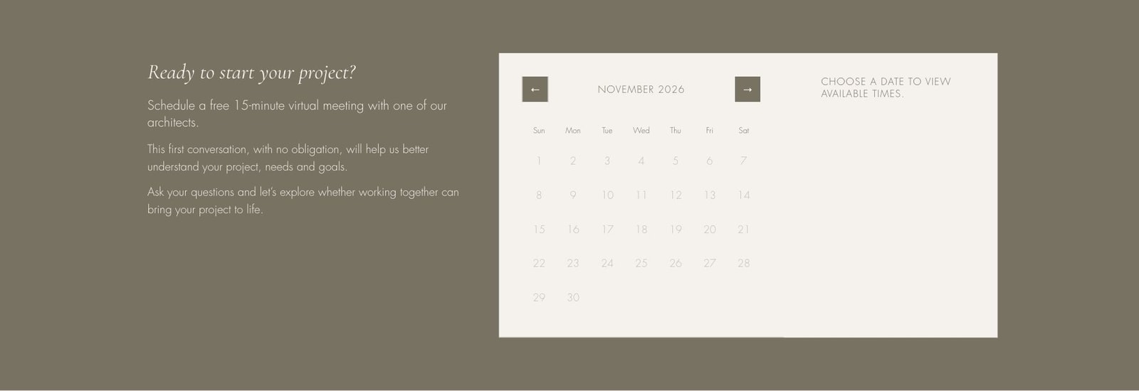
The Contact page calendar shows the dates available for a first 15-minute virtual meeting.
A website that supports early project decisions
The bilingual site brings together the studio’s portfolio, advice and tools for prospective clients. Someone with an early idea can start with the articles. Someone with a project in mind can explore fees and book a consultation.
Seeing how other projects took shape helps visitors clarify their own priorities and arrive at the first consultation with more specific questions.